The Services section got simpler: filters that did not belong were removed, every remaining key returns results
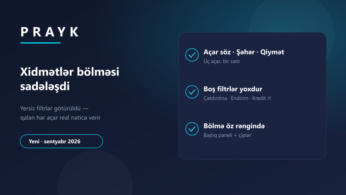
In September we rebuilt every root section of Prayk: each one now opens like a dedicated, specialised site — its own header, its own colour, its own menu and only the filters that work there. This post is about the Services section.
1. The section's own panel
At the top of the page sits a dark cyan panel: the section name, the number of active listings and the trail inside the section. The white card inside it is the search form, so the first action can be taken on the first screen. The panel is deliberately compact — the first row of listings below it is visible on opening.
2. The biggest change is the filter clean-up
Every section used to show the same toggles. In services all of them were out of place: "Delivery" (a service is not delivered), "Discount", "Credit", "New / Used" (a service has no "used" state) and "Good deals" (the market median is computed only for cars and real estate). Live measurements confirmed it — in this section those keys almost always returned an empty result.
They are all gone. The panel now has three keys — keyword, city, price — and every one of them returns real results. The "More" button opens the current category's own fields and the seller type.
This is not simply about having fewer buttons: a filter that does nothing makes the site itself feel broken. Hence the rule — a filter stays on screen only where it returns results.
3. One filter surface
Filters used to sit both at the top and in the left column. Now there is a single surface: the top panel. On mobile the quick chip row is simpler, and the full set lives in the "All filters" sheet.
4. Category chips
The chips under the panel show the current level — service areas at the root, an "up" link plus children inside a subcategory. With more than eight of them the order follows listing counts, and "Other" stays at the end.
5. The header and search stay inside the section
On a computer the top row turns into the section's menu: the badge and name next to the logo, the section's categories in the second row. The search box at the top searches inside the section: type "translation" and you get services rather than the whole site; the cross on the chip widens the search again.
6. The mobile app works the same way
The section header, the search card and the colour were ported to the app.
Masters are a section of their own
Since the beginning of September, repair, construction and installation masters live in their own root section, Masters — with the same simple panel. Services keeps the remaining areas (translation, tutoring, transport, legal, beauty and others).
What has not changed
The address is the same: /services and every subcategory. Saved links and favourites keep working; dark mode contrast was checked separately.
To post a service listing: the new listing form. What changed in the other sections: Masters and Jobs.